

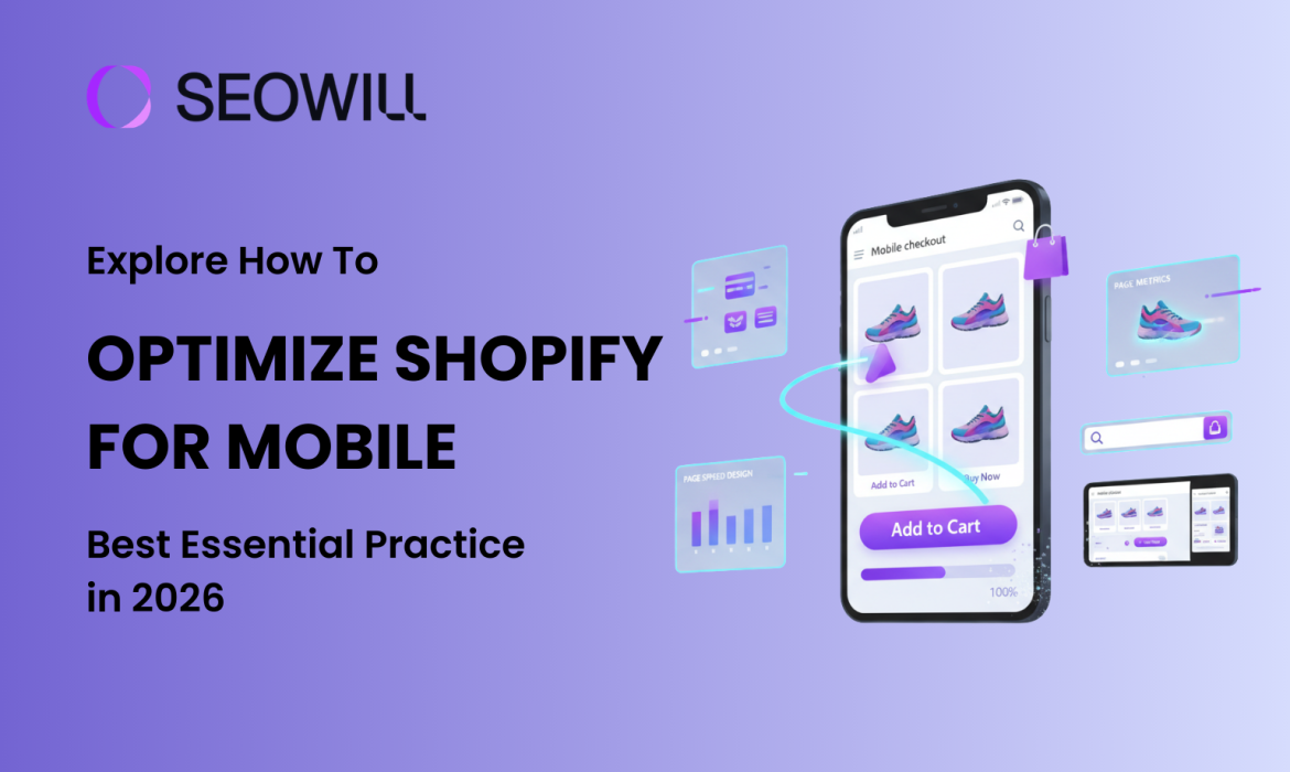
Mobile shopping is not just a fad – it’s the primary way people shop online in 2026. Currently, over 70% of all e-commerce traffic is mobile, but the average mobile conversion rate is only 1.8%, versus 3.9% on the desktop. The difference represents a huge opportunity for Shopify merchants who can master mobile optimization.
In this thorough guide, you will learn how to optimize Shopify for mobile using consumer-tested mobile optimizing best practices that will work in 2026. Whether you are a complete beginner or someone who has some experience, you will follow actionable best practices to help improve your mobile page speed performance, refine the user experience, and, ultimately, convert mobile visitors into paying customers.
Table of Contents
Why Optimizing Shopify for Mobile Critical for Your Store in 2026
Mobile optimization isn’t optional anymore—it’s essential for survival in the competitive e-commerce landscape. Here’s why:
Mobile Commerce Dominates E-Commerce
The numbers tell a compelling story:
- 74% of e-commerce traffic now originates from mobile devices
- Mobile commerce is projected to reach $564 billion in the US alone in 2026
- Mobile shoppers are increasingly comfortable making purchases on their phones
However, there’s a conversion gap you need to close. While mobile traffic dominates, mobile conversion rates (1.8%) still lag behind desktop (3.9%). This means optimizing your mobile experience could potentially double your mobile revenue.
Google’s Mobile-First Indexing Changes Everything
Since 2019, Google has used mobile-first indexing for 100% of websites. This means:
● Google mainly relies on your mobile site to determine rankings
● If your mobile site loads slowly or is not well optimized, your rankings will suffer
● Core Web Vitals(mobile speed ranking signals) are direct ranking signals
● Mobile usability problems can prevent your site from being included in search results
Your desktop site could be perfect, but your poor mobile experience means you will rank lower on Google.
The 3-Second Rule
Mobile users are impatient – and rightfully so. Research shows:
● 53% of mobile visitors leave sites that take longer than 3 seconds to load
● For every 1-second delay in page load time, conversions fall 7%
● 85% of mobile buyers expect sites to load as fast or faster than desktop
Ultimately, a non-optimized Shopify site will cost you potential revenue every day. And the upside is huge – stores that have their mobile-optimized first can see an improvement of 30-50% more or greater in their conversion rate.
5 Quick Wins to Optimize Shopify for Mobile Performance (No Coding Required)
Let’s start with easy improvements you can implement right now to see immediate results.
Quick Win #1: Choose a Mobile-Optimized Theme
Your Shopify theme is the foundation of your mobile experience. Not all themes are created equal when it comes to mobile performance.
Action Steps:
- Go to your Shopify admin → Online Store → Themes
- Click Theme settings and preview your store on mobile
- Check for these mobile optimization features:
- Responsive design that adapts to any screen size
- Fast loading times (test with Google PageSpeed Insights)
- Touch-friendly buttons and navigation
- Readable text without zooming
Top Mobile-Optimized Shopify Themes for 2026:
- Dawn (Free) – Shopify’s fastest theme, built for Online Store 2.0
- Impulse (Premium) – Excellent mobile navigation and speed
- Debut (Free) – Simple, fast, mobile-friendly
- Turbo (Premium) – Lives up to its name with speed focus
If your current theme consistently scores below 50 on mobile PageSpeed tests, consider switching to a lighter, more mobile-optimized theme.
Quick Win #2: Enable Mobile-Friendly Navigation
Complex navigation kills mobile conversions. Mobile screens are small, and users make decisions quickly.
Best Practices:
- Limit menu items to 3-5 main categories (use sub-menus for more)
- Use a hamburger menu (three horizontal lines) that’s easy to tap
- Make your search bar prominent and easy to access
- Include a sticky header so navigation is always accessible
Action Steps:
- Go to Online Store → Navigation
- Review your main menu and remove unnecessary items
- Group related categories under dropdown menus
- Test the navigation on your phone – can you find products in 2-3 taps?
Remember: Every additional tap increases the chance of abandonment.
Quick Win #3: Optimize Your Homepage for Mobile
Your mobile homepage needs to communicate value instantly – users won’t scroll through unnecessary content.
Mobile Homepage Essentials:
- Clear value proposition above the fold (visible without scrolling)
- Large, tappable call-to-action buttons (minimum 44×44 pixels)
- Optimized hero images that load fast (under 150KB)
- Limited content – show only your best products or offers
- Social proof – display trust badges, reviews, or customer counts
Action Steps:
- Open your store on your phone
- Ask yourself: “Within 3 seconds, do I know what this store sells and why I should buy?”
- Remove any clutter, excessive text, or distracting elements
- Make your primary CTA button impossible to miss
Quick Win #4: Implement Tap-to-Call & Tap-to-Email
Mobile shoppers often want to contact you directly from their phone. Make it effortless.
Action Steps:
- Go to Online Store → Themes → Customize
- Add your phone number and email in the header or footer
- Format phone numbers with the
tel:link:<a href="tel:1-555-123-4567">1-555-123-4567</a> - Format emails with
mailto::<a href="mailto:[email protected]">[email protected]</a>
When properly formatted, these create clickable buttons that open the phone dialer or email app with one tap – dramatically reducing friction for mobile customers who have questions.
Quick Win #5: Remove Intrusive Pop-ups
Google penalizes sites with intrusive mobile interstitials (pop-ups that cover the main content).
What to Avoid:
- Pop-ups that appear immediately after a page has loaded
- Full-page overlays that cover up content
- Difficult-to-close mobile pop-ups
Mobile-Friendly Alternatives:
- Pop-ups that are triggered once a visitor attempts to leave the site (exit intent)
- Sticky bars (appears on top or bottom), which are not as disruptive as other pop-up types
- Slide-in animations from the lower corner, which create less disturbance for users
- Timed delay (30-60 seconds) before displaying pop-ups
Action Steps:
- Visit your store on mobile
- Test if any pop-ups appear too quickly or block content
- Adjust timing or switch to less intrusive formats
- Ensure close buttons are large and easy to tap (min 44x44px)
These five quick wins can be implemented today and will immediately improve your mobile user experience, often resulting in measurable bounce rate and conversion improvements within days.
How to Optimize Shopify for Mobile Page Speed
Page speed is the #1 factor in mobile optimization. A slow site drives customers away before they even see your products.
Understanding Core Web Vitals
Google uses three key metrics to measure mobile performance:
- Largest Contentful Paint (LCP) – How long until the main content loads
- Target: Under 2.5 seconds
- Measures perceived loading speed
- Interaction to Next Paint (INP) – How quickly your site responds to interactions
- Target: Under 200 milliseconds
- Replaced FID (First Input Delay) in 2024
- Cumulative Layout Shift (CLS) – Visual stability (elements not jumping around)
- Target: Under 0.1
- Measures how much content shifts as page loads
Now let’s optimize each one.
Step 1: Image Optimization (Biggest Impact)
Images typically account for 50-70% of a page’s file size. Optimizing them delivers the biggest speed improvement.
Action Steps:
- Compress all images before uploading
- Use SEOAnt to compress images
- Target: Under 150KB for hero images, under 100KB for product images
- Aim for 70-80% quality (perfect balance of quality/speed)
- Use WebP format with JPEG fallback
- WebP images are 25-35% smaller than JPEG
- Modern browsers support WebP; Shopify handles fallbacks automatically
- Apps like TinyIMG automate WebP conversion
- Implement lazy loading
- Images load only when user scrolls to them
- Shopify themes built after 2021 include lazy loading by default
- For older themes, use apps like Lazy Load by Booster Apps
- Use appropriate image dimensions
- Don’t upload 3000px images for 500px display sizes
- Recommended sizes:
- Product images: 1200x1200px
- Hero images: 1600x900px
- Thumbnail images: 400x400px
- Add descriptive alt text
- Helps SEO and accessibility
- Format: “[Product name] – [key feature or color]”
- Example: “Leather backpack – brown vintage style”
Step 2: Minimize JavaScript and CSS
JavaScript and CSS files can significantly slow down mobile loading times.
Action Steps:
- Audit and remove unnecessary apps
- Go to Apps in Shopify admin
- Ask: “Do I really need this app?”
- Each app adds code that slows your site
- Keep only essential apps (aim for 3-5 maximum)
- Check for unused code in your theme
- Go to Online Store → Themes → Actions → Edit code
- Look for old apps’ code that wasn’t fully removed
- Search for comments like
<!-- Start of App Name -->and remove if app is deleted
- Use Shopify’s built-in speed report
- Go to Online Store → Themes → Click … → View speed report
- Identify apps slowing your store
- Consider alternatives or removal
- Defer non-critical JavaScript
- Most modern Shopify themes do this automatically
- If using older themes, consider updating to Online Store 2.0
Result: Reducing JavaScript can improve INP scores by 20-40% and decrease time to interactive.
Step 3: Leverage Browser Caching and CDN
Caching stores copies of your site’s files so repeat visitors load pages faster.
Good News: Shopify automatically handles this for you:
- Built-in Content Delivery Network (CDN) distributes your site globally
- Browser caching is pre-configured
- All assets are served from fast, distributed servers
Action Steps:
- Verify your images are hosted on Shopify’s CDN (URLs should contain
cdn.shopify.com) - Avoid hotlinking images from external sites when possible
- If using custom fonts, host them on Shopify or use a fast CDN like Google Fonts with preconnect
Result: Shopify’s CDN typically reduces loading time by 30-50% for international visitors.
Step 4: Reduce HTTP Requests
Every file (image, script, stylesheet) requires a separate HTTP request, slowing load time.
Action Steps:
- Combine similar files where possible
- Modern Shopify themes bundle CSS and JavaScript automatically
- Verify in theme code that you don’t have multiple CSS files loading separately
- Evaluate third-party scripts
- Analytics, chat widgets, and tracking pixels add requests
- Essential: Google Analytics, Facebook Pixel
- Evaluate: Heatmaps, A/B testing tools, social feeds
- Load non-essential scripts asynchronously
- Remove social media feed widgets
- Instagram/Twitter feeds require multiple requests
- Consider static screenshots linked to profiles instead
Result: Reducing HTTP requests from 100+ to 50-60 can improve load time by 20-30%.
Step 5: Test with Google PageSpeed Insights
Regular testing helps you track progress and identify new issues.
Action Steps:
- Run a mobile speed test
- Go to PageSpeed Insights
- Enter your store URL
- Click “Analyze”
- Interpret your scores
- 90-100 (Green): Excellent
- 50-89 (Orange): Needs improvement
- 0-49 (Red): Poor (urgent attention needed)
- Focus on Field Data (real user metrics)
- This shows actual customer experience
- More important than Lab Data (simulated test)
- Prioritize recommendations
- Fix red items first
- Focus on suggestions that save the most time
- Ignore “Opportunity” items saving less than 0.5 seconds
- Re-test after changes
- Document your baseline scores
- Implement optimizations
- Test again after 48 hours (allows caching to stabilize)
- Aim for 10-20 point improvements with each round
Alternative Testing Tools:
- GTmetrix – Detailed waterfall analysis
- WebPageTest – Advanced testing with video recording
- Shopify Online Store Speed Report – Built-in Shopify dashboard
Target Scores for Mobile:
- Overall Performance: 70+ (good), 90+ (excellent)
- LCP: Under 2.5 seconds
- INP: Under 200ms
- CLS: Under 0.1
Achieving these targets typically results in 30-50% improvement in mobile conversion rates.
Frequently Asked Questions About Shopify Mobile Optimization
Q1: How long does it take to see results from mobile optimization?
When you make quick changes, such as eliminating pop-ups or activating shop pay, you will notice significant changes in your mobile site’s bounce rate and conversion rate within days. You will also see an increase in the percentage of users who complete their checkout process.
Optimizing the speed, usability, and checkout process for your mobile site usually produces a considerable amount of traffic and ranking increases two to four weeks after the optimization has been completed. Google will take a period of time to re-crawl and re-index your mobile website after you have completed the optimizations mentioned above.
Long-term benefits increase exponentially as you continue to improve your mobile site. A retailer that continues to optimize its mobile site will continue to see improvements in conversion rates, average order values, and customer satisfaction over time frames ranging from “months” to “years.”
Q2: Do I need coding skills to optimize Shopify for mobile?
No. 80-90% of effective mobile optimization requires zero coding:
- Theme selection
- Image optimization (use free tools like TinyPNG)
- Navigation simplification
- Checkout settings
- App installation and configuration
- Payment method setup
Q3: What’s the ideal mobile page load time?
Targets:
- Good: Under 3 seconds
- Great: Under 2.5 seconds
- Excellent: Under 2 seconds
Q4: How often should I test mobile performance?
Minimum schedule:
- After any changes: Test immediately
- Monthly: Comprehensive mobile audit
- Quarterly: User testing and heatmap review
Recommended schedule:
- Weekly: Quick PageSpeed Insights check
- After installing/removing apps: Always test impact
- After theme changes: Test extensively
- Bi-weekly: Review mobile conversion metrics
- Monthly: Full device testing (iPhone, Android, different networks)
- Quarterly: Comprehensive UX review and user testing
Set reminders: Add mobile performance checks to your calendar. It’s easy to forget, but regular monitoring prevents gradual performance degradation.
Q5: What’s the best free way to test mobile optimization?
Top free tools:
- Google PageSpeed Insights (pagespeed.web.dev)
- Google Mobile-Friendly Test (search.google.com/test/mobile-friendly)
- Shopify Online Store Speed Report
- Your own phone
Free app: Hotjar (limited free plan) for session recordings and heatmaps.
Q6: Can mobile optimization help my SEO rankings?
Absolutely yes. Mobile optimization is one of the strongest ranking factors in 2026.
How mobile optimization improves SEO:
- Mobile-first indexing: Google primarily uses your mobile site for ranking
- Core Web Vitals: Direct ranking factor
- Reduced bounce rate: Lower bounce rates signal quality to Google
- Better user engagement: More time on site, more pages visited
- Backlink potential: Better sites earn more natural links
- Local SEO: Especially important for mobile searches
Related Resources: